How to add placeholder text to form fields
Write the grey hint text a respondent sees inside an empty input, which types take one, and what is drawn when you leave it blank.
Placeholder text is the light grey hint drawn inside an empty input. It is a good place for a short instruction or an example of the shape you expect, such as a date format or a sample address. Here is how to set it in Tinyform.
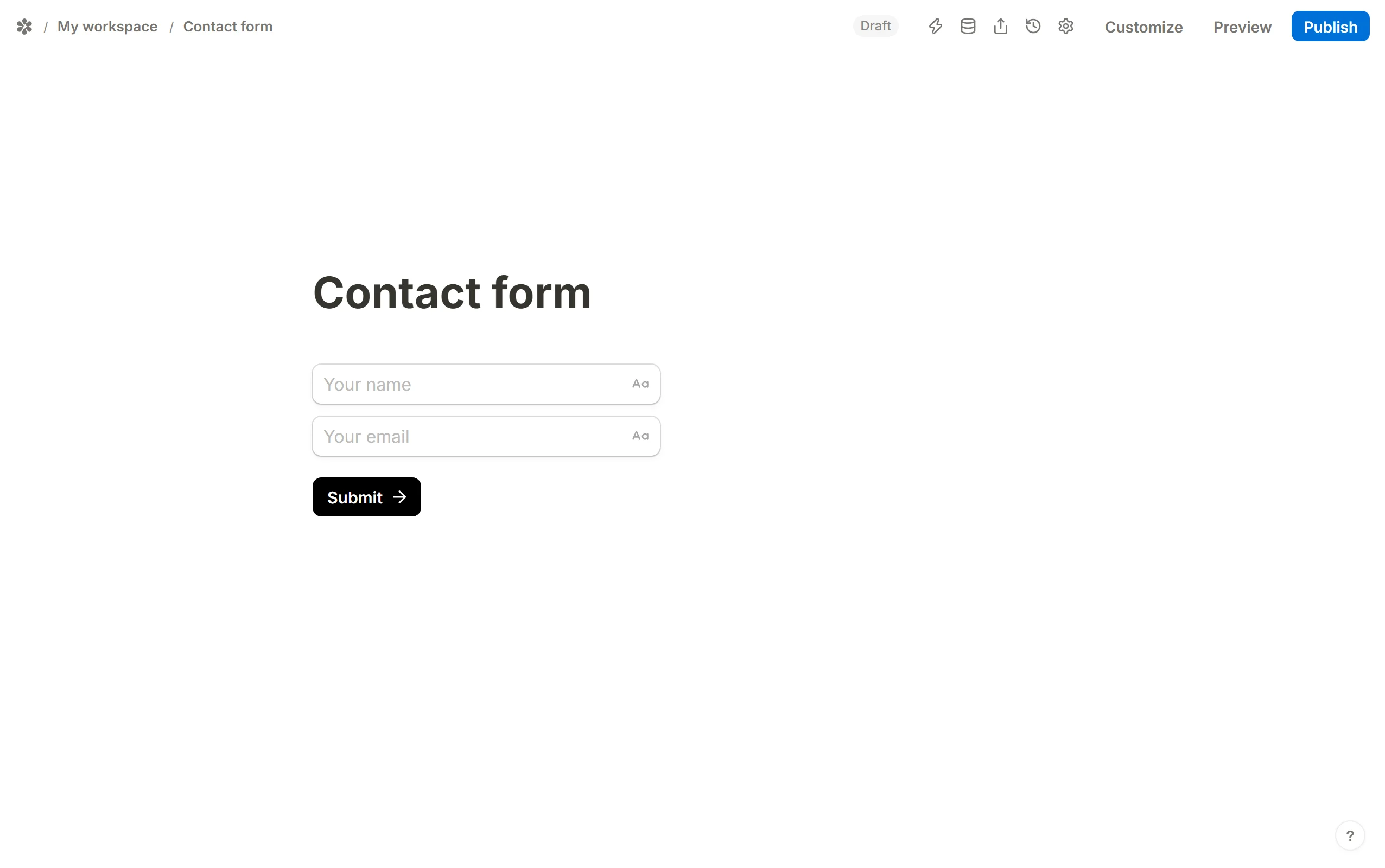
Text-style inputs
For inputs that take typed text, the placeholder is edited right on the canvas: click into the control below the question and type. What you write is drawn in grey on the published page.
The types that take one are Short answer, Long answer, Email, Phone, Number, Link, Date and Time.

Leave it empty and each type falls back to a hint of its own:
| Type | Default placeholder |
|---|---|
| Short answer, Long answer | Type your answer… |
| name@example.com | |
| Phone | +1 (555) 000-0000 |
| Number | 0 |
| Link | https://… |
| Date | Select date |
| Time | Select time |
Dropdown and multi-select
A Dropdown and a Multi-select have no text box to type into on the canvas, so their placeholder lives in the settings popover instead. Open the question's settings and fill in the Placeholder row; it is drawn in the closed control until a choice is made. With nothing written, the control reads "Select…".

Longer guidance
A placeholder disappears the moment someone types, so it is the wrong place for anything they need to keep reading. For that, add the question's second line with Add label, or put a Text or Label block above the input.