Popup forms
Open a form as a small panel over your own site, triggered by a click, a timer, a scroll or an exit, with a snippet from the Share tab.
A popup form is your form drawn as a card over your own website, in the corner or in the centre, opened by something a visitor does. It is the same published form, framed by a script that Tinyform serves, so anything the form does, from logic to notifications, works inside the popup. Set it up once on the Share tab and paste the result into your site.
Create a popup
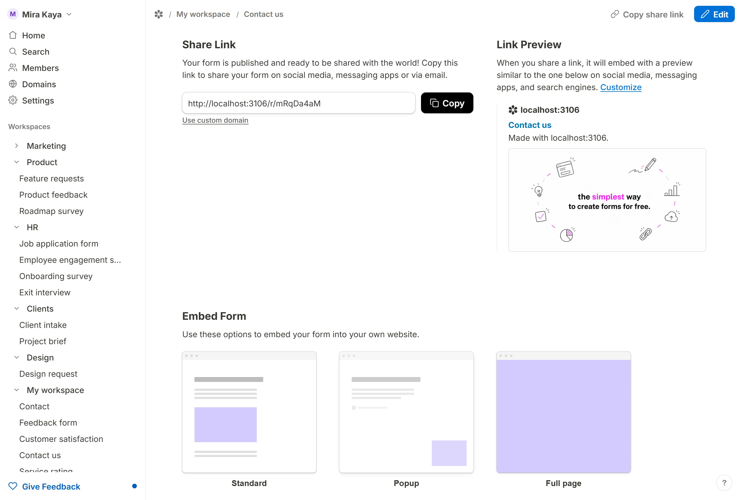
Start with a published form. Open its Share tab, go to Embed Form and pick Popup.
Popup options
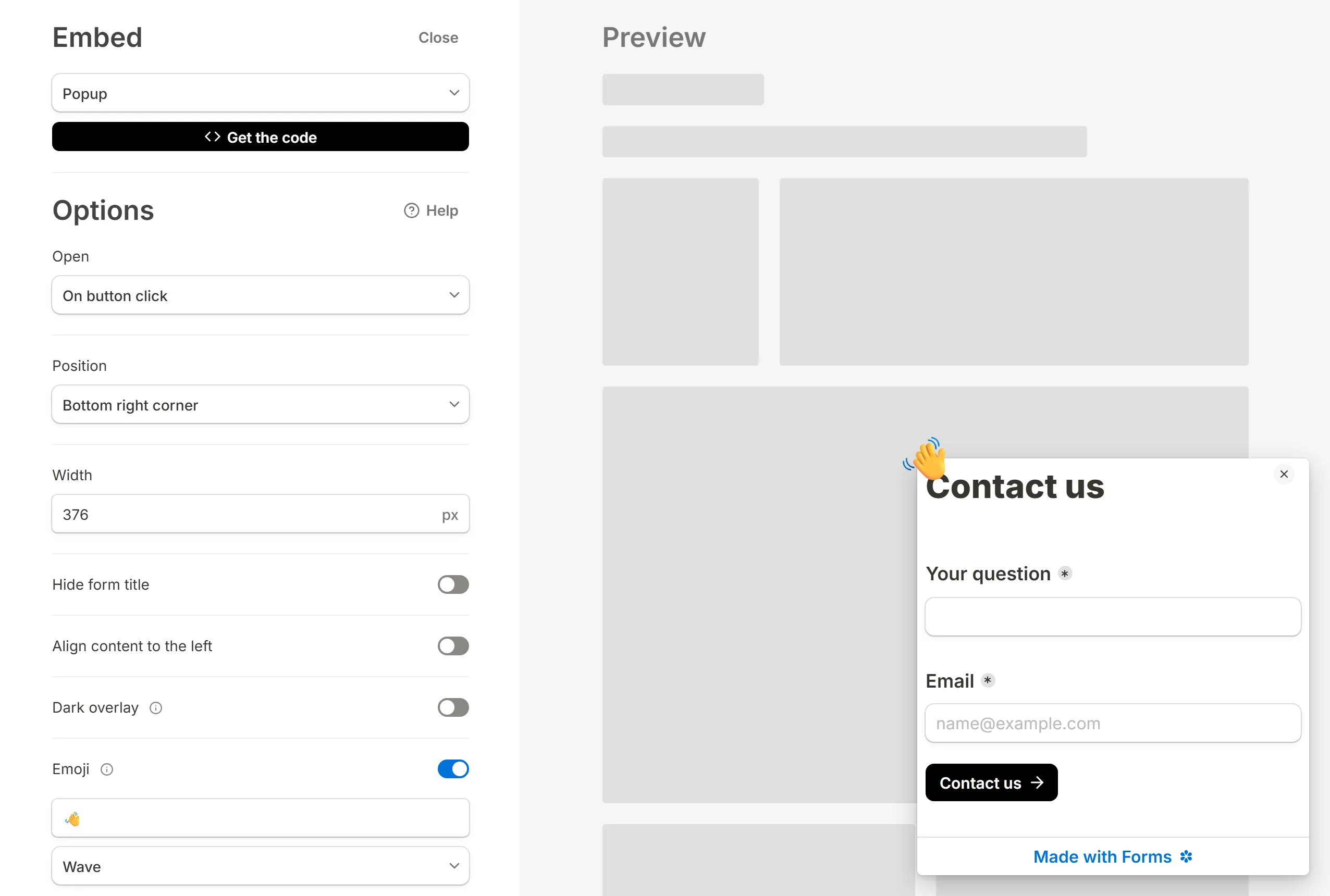
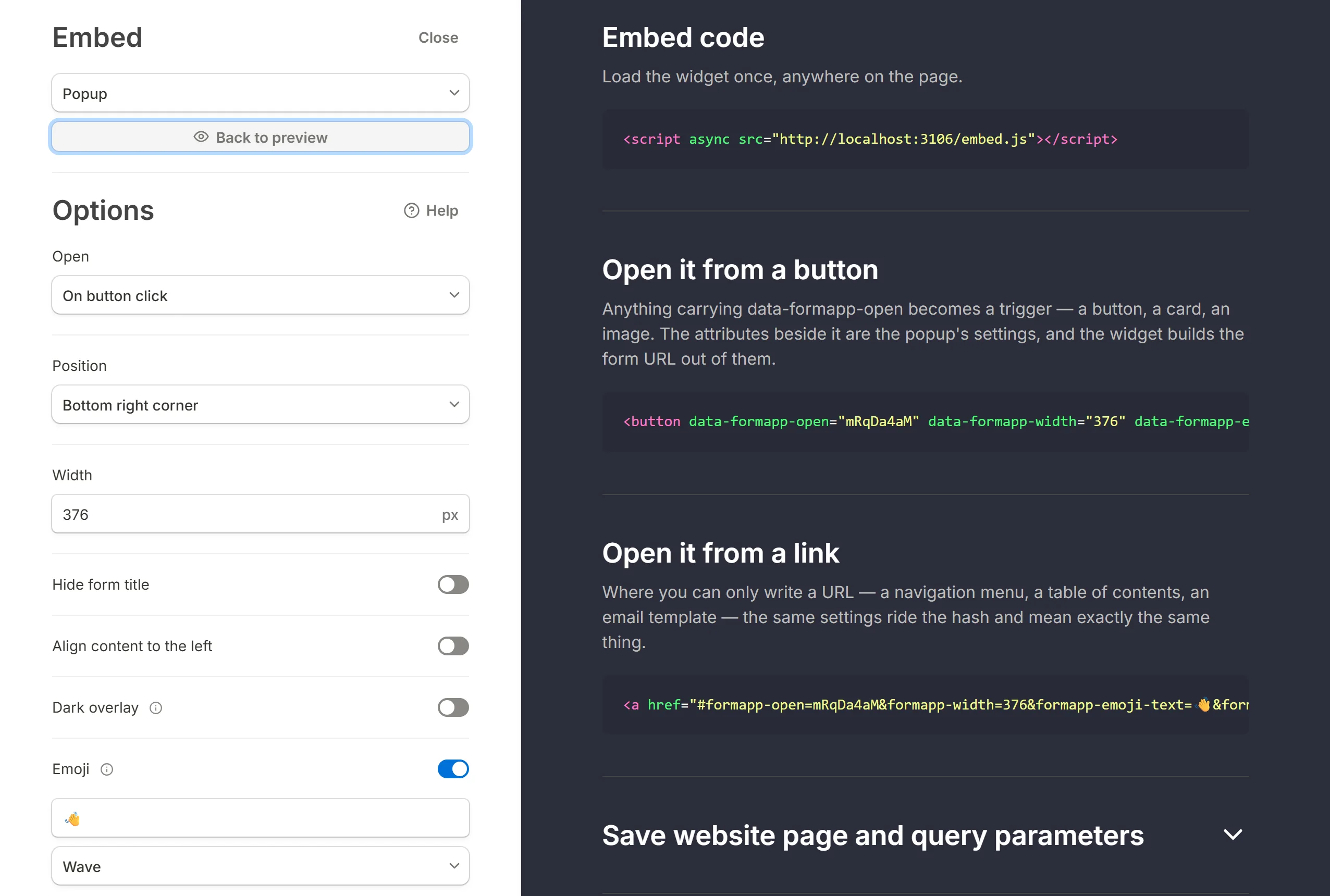
The dialog has the options on the left and a live preview of the panel on the right. Every change is reflected in the preview and in the code.
Open
Decides what makes the popup appear:
- On button click: when a visitor presses an element on your page. This is the default.
- On page load: as soon as the page opens.
- After elapsed time: after a number of seconds you set; 3 by default.
- On exit intent: when the pointer leaves the page through the top edge, the way it does on the way to the tab bar.
- After scrolling: once the visitor has scrolled a percentage of the page you set; 50% by default.
Position
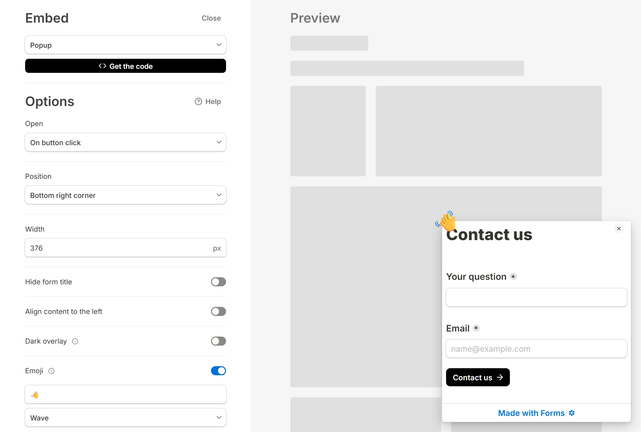
Bottom right corner or Center. A centred popup always dims the page behind it.
Width
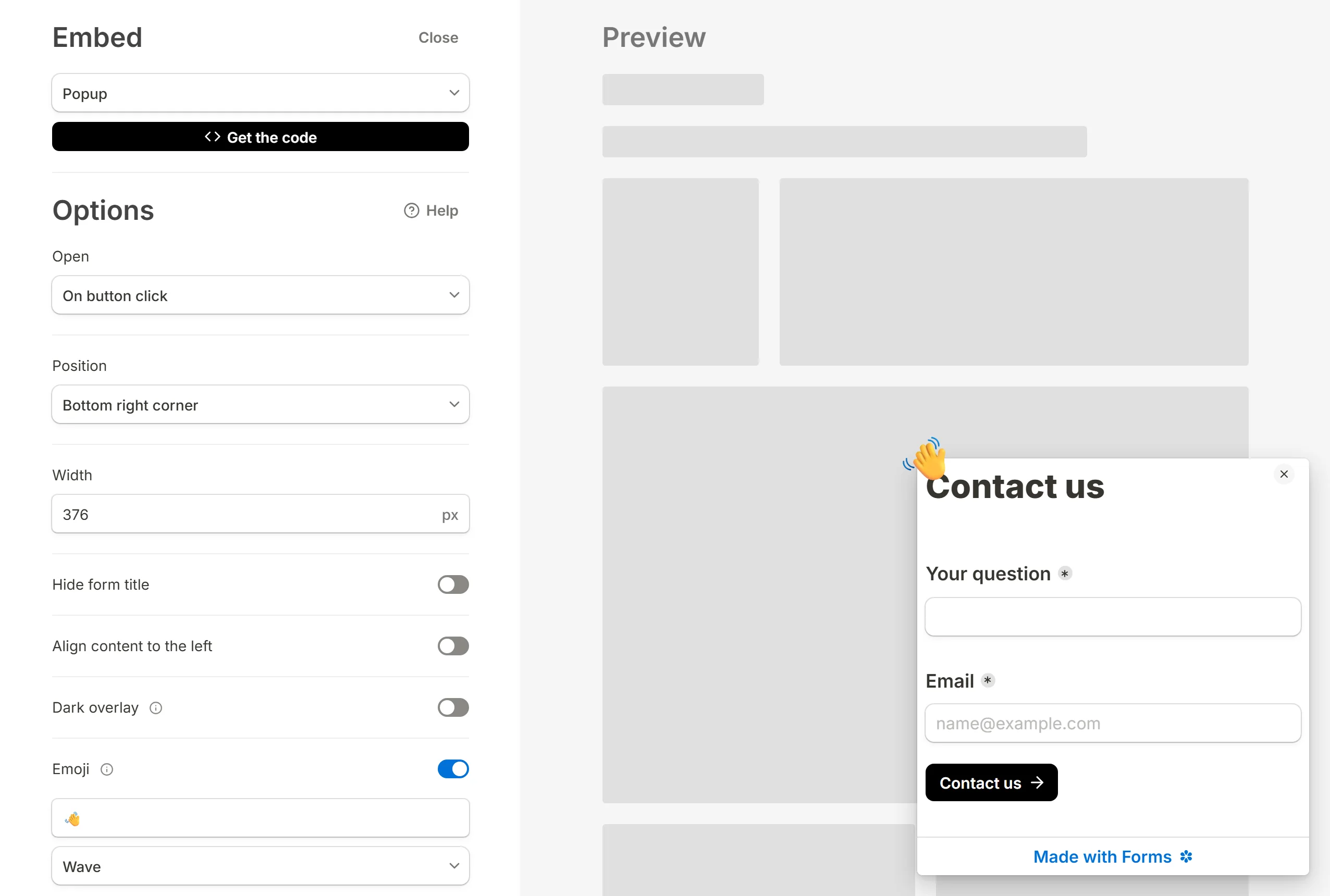
The panel's width in pixels, 376 by default and never narrower than 240. On a narrow screen the panel stays 20 pixels clear of both edges whatever width you set, and its height is a share of the viewport rather than a fixed number.
Hide form title
Leaves the form's title out of the panel.
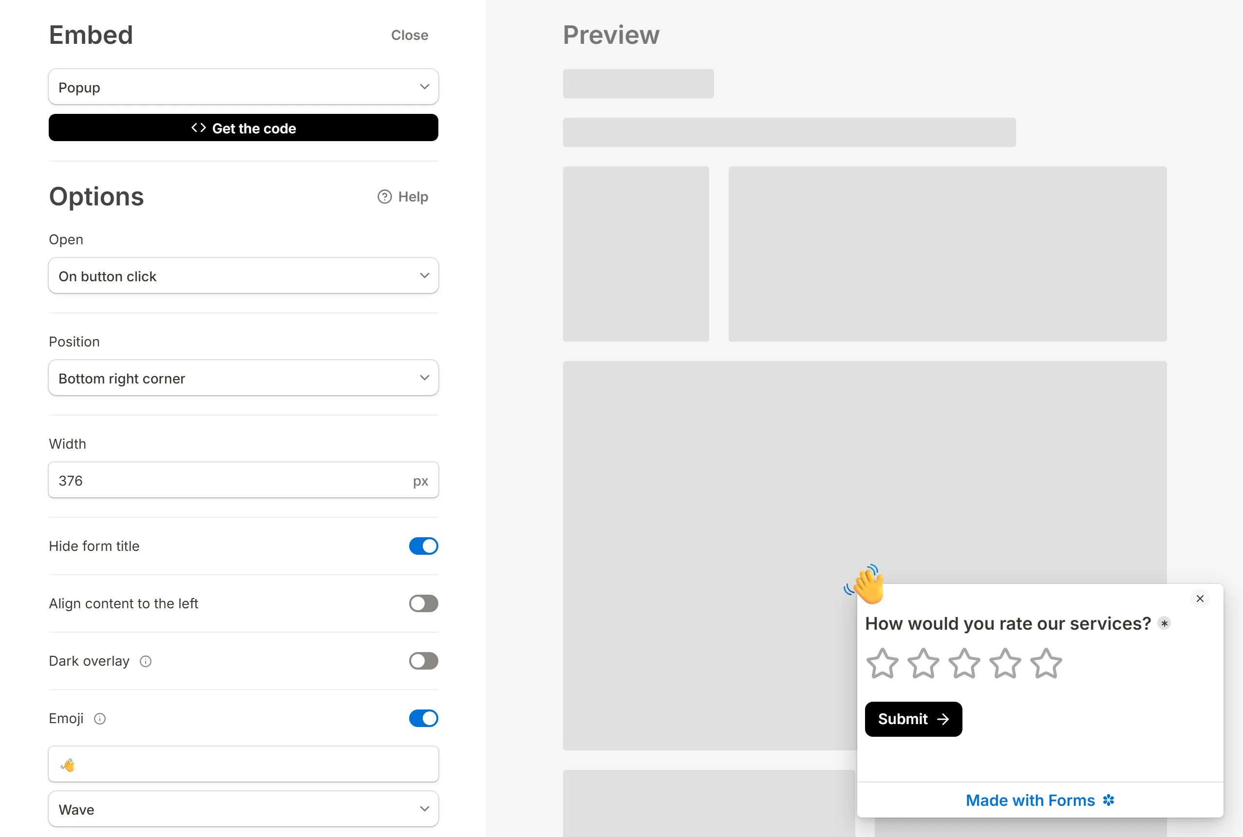
Align content to the left
Aligns the form's content to the left edge of the panel instead of centring it. Useful once you have made the panel wide.
Dark overlay
Dims the page behind the panel while it is open, so the popup stands out. A corner popup has it off by default.
Emoji
A bubble on the panel's corner to draw the eye. Type any emoji into the box and pick an animation: None, Wave, Tada, Heart beat, Spin, Flash, Bounce, Rubber band or Shake. The default is a waving hand. To open the emoji keyboard, press Win + . on Windows or Cmd + Ctrl + Space on a Mac.
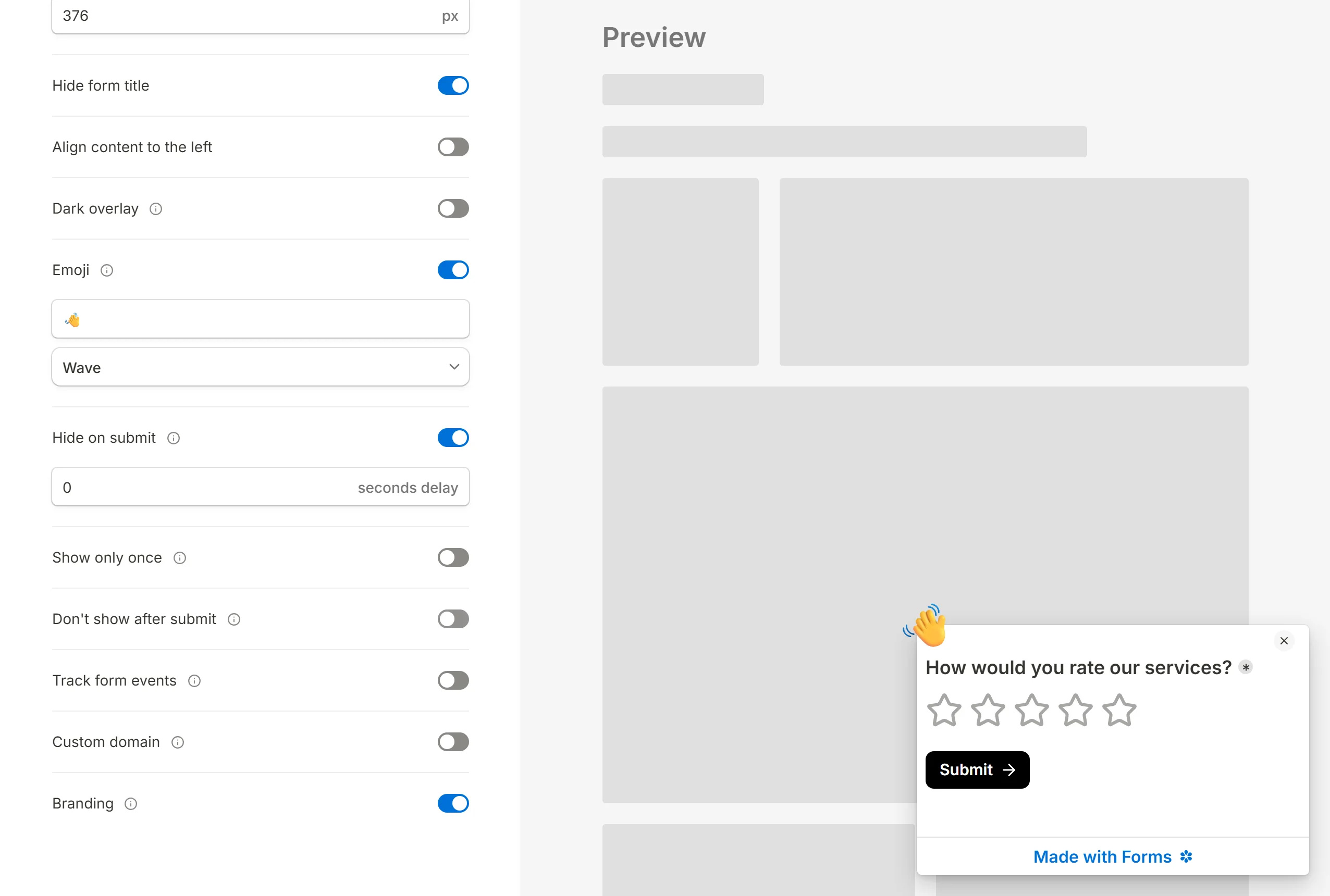
Hide on submit
Closes the panel once the form has been sent. It is on by default, and the number beside it is how many seconds to wait first; 0 closes it at once.
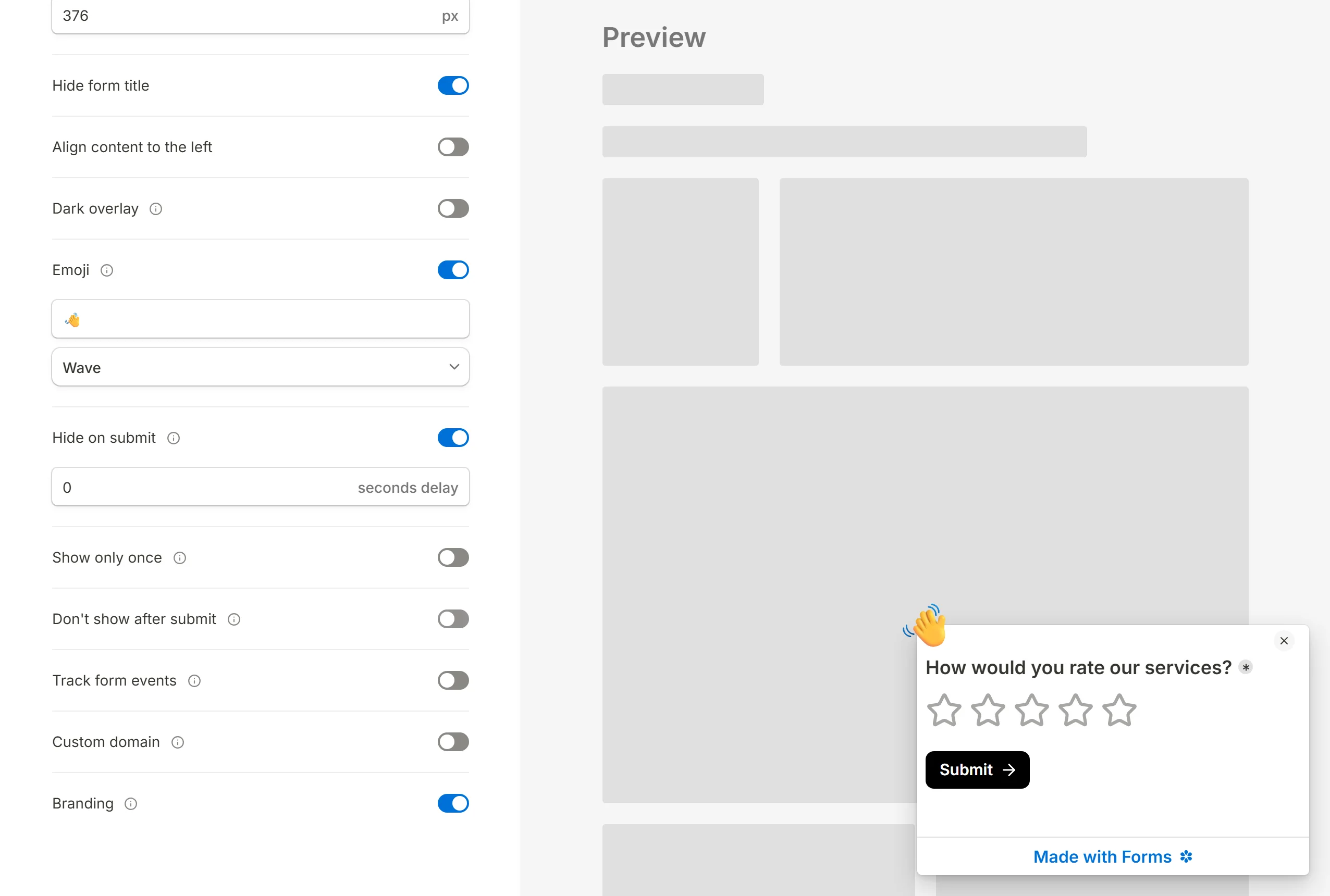
Show only once
A visitor who has seen the popup does not see it again. The memory lives in that visitor's browser, so clearing site data or switching browsers shows it once more. This applies to the automatic triggers only; a click always opens the popup, because the visitor asked.
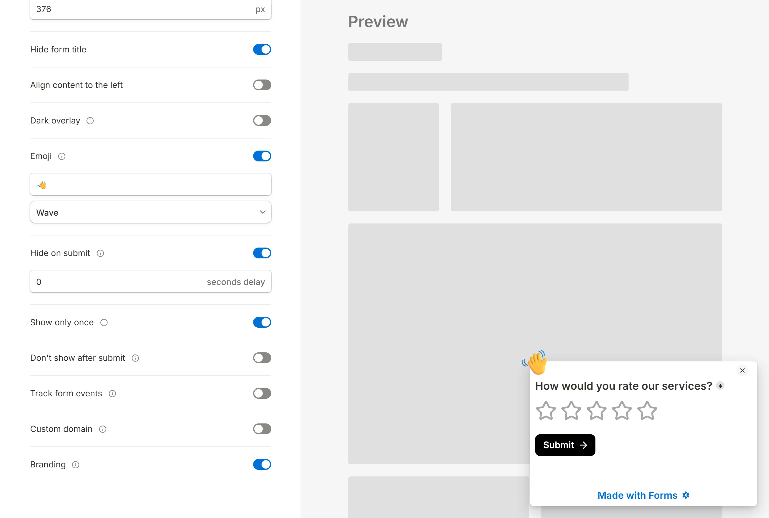
Don't show after submit
A visitor who has already submitted the form is left alone from then on. Like Show only once, it applies to the automatic triggers and is remembered per browser.
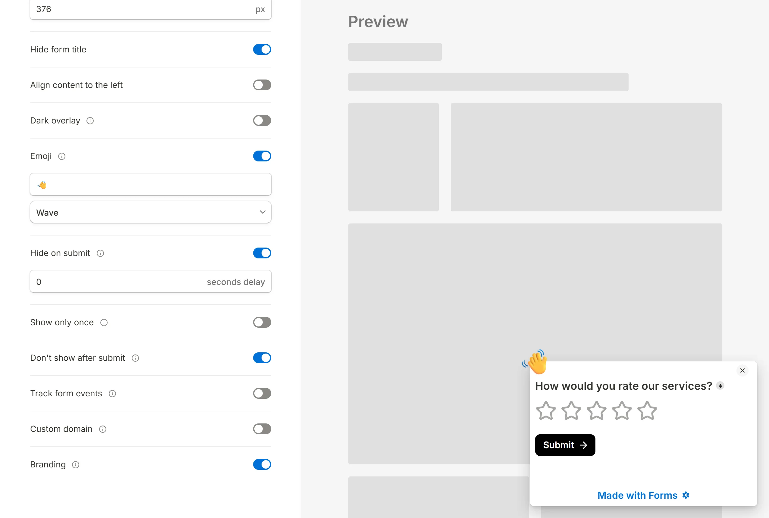
Transparent background, Track form events, Branding
Three more switches sit with the rest. Transparent background lets the panel take the page's background instead of painting its own. Track form events forwards page views and submissions to the analytics your own site already runs. Branding is the "Made with" badge at the foot of the form; see Remove the branding badge. Below 576 pixels the badge becomes the panel's bottom bar.
Customize the popup
Design options
Everything about how the form looks inside the panel is decided in the editor's Customize panel: colours, font, roundness and custom CSS. See Customize your form.
Serve the popup from a custom domain
Switch on Custom domain in the dialog and the frame inside the panel loads from the domain connected to the form, so your site and the form share a host. Scripts and styles placed in that domain's code injection box then run inside the popup as well. Connecting a domain is a paid feature; see Custom domains.
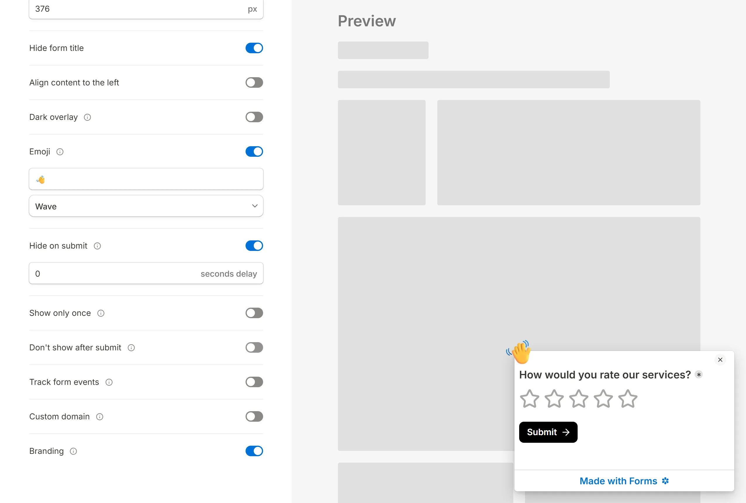
Add the popup to your website
Press Get the code. What you get depends on the trigger you chose: a script tag plus something to attach it to, or a script tag plus a small configuration object.
Copy the embed code
Get the code
Press
Get the codeonce the options are set, and copy the snippet with the button beside it.Paste it into your site
Put it in the page's HTML, in the head or anywhere before the closing body tag.
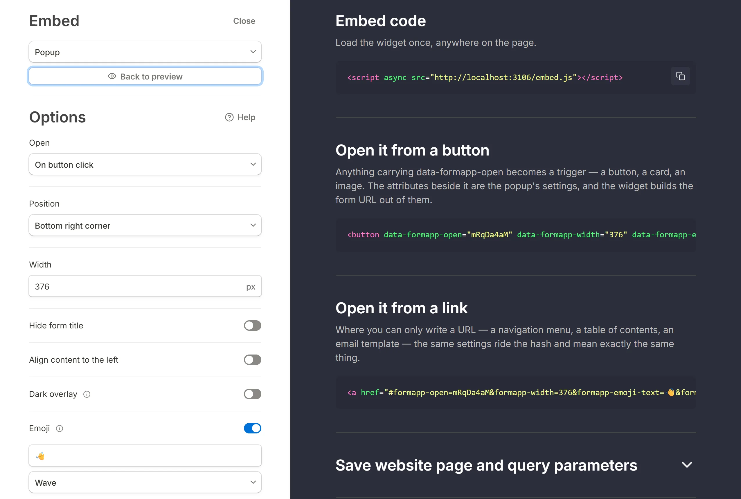
Open on button click
A click-triggered popup needs to know which element to listen to. The snippet has two parts:
Load the script
Paste the script tag into the page's HTML.Mark the button
Copy the
data-tinyform-attributes from the snippet onto the button or any other clickable element. The first,data-tinyform-open, names the form; the others carry the options you chose.
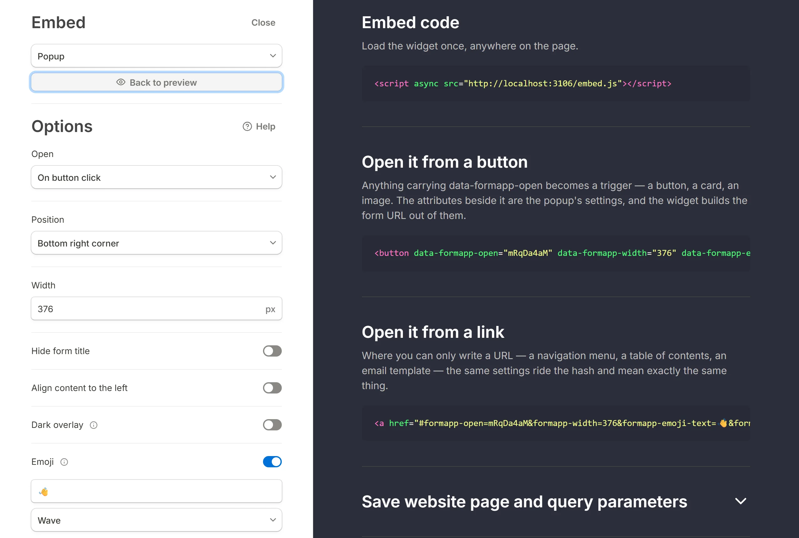
Buttons rendered after the page has loaded work too: the script watches clicks on the whole document rather than binding to elements at load time.
If you cannot edit the button's attributes, use the link form instead: point a link at #tinyform-open=<form id> followed by the same settings, and the script opens the popup when the link is clicked without leaving the address in the address bar.
Save the page and its query parameters with hidden fields
The page the visitor was on, and every query parameter in its address, are forwarded into the form automatically. Add hidden fields with matching names to keep them: a field named originPage receives the page's path, and fields named after the page's parameters receive their values. An element that opens the popup can pass values of its own as data-tinyform-<name> attributes; any name that is not one of the widget's own options arrives as a hidden field.
For example, with hidden fields originPage, ref and email, a visitor arriving from the address below submits originPage=/register, ref=downloads and email=alice@example.com.
https://company.com/register?ref=downloads&email=alice@example.com
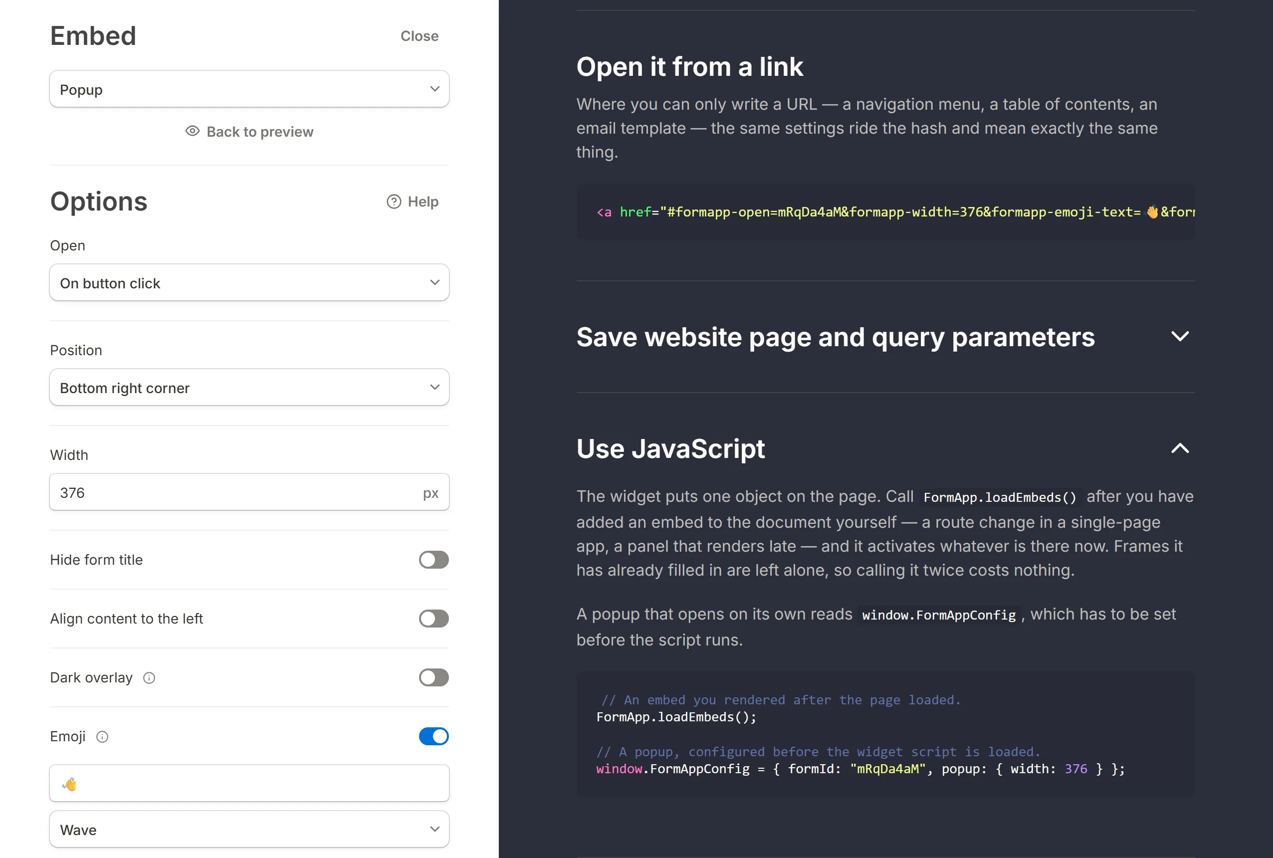
Use JavaScript
For a site with its own rules about when a popup should open, the script exposes a small API on window.TinyForm. TinyForm.openPopup(formId, options) opens the panel from your own code, with the same option names the attributes use (position, width, emojiText, hideOnSubmit and the rest). An automatic trigger is written as a window.TinyFormConfig object placed before the script tag, which is what the generated snippet does for you. The Use JavaScript section of the code pane has copyable examples to hand to a developer.
Add a popup to a Notion site
A Notion page published through Super can carry the snippet; see Add popup forms to Notion with Super.