Customize your form
Change your form's theme, colours and font, size its inputs and buttons, add a logo and cover, format text, and inject custom CSS, all from the editor.
A Tinyform form can look like part of your site rather than like a form builder. From the editor you can switch the theme, pick colours and a font, resize the page, the inputs and the buttons, add a logo and a cover above the title, and paste CSS for anything the controls do not reach. The canvas is a live preview, so each change shows as you make it.
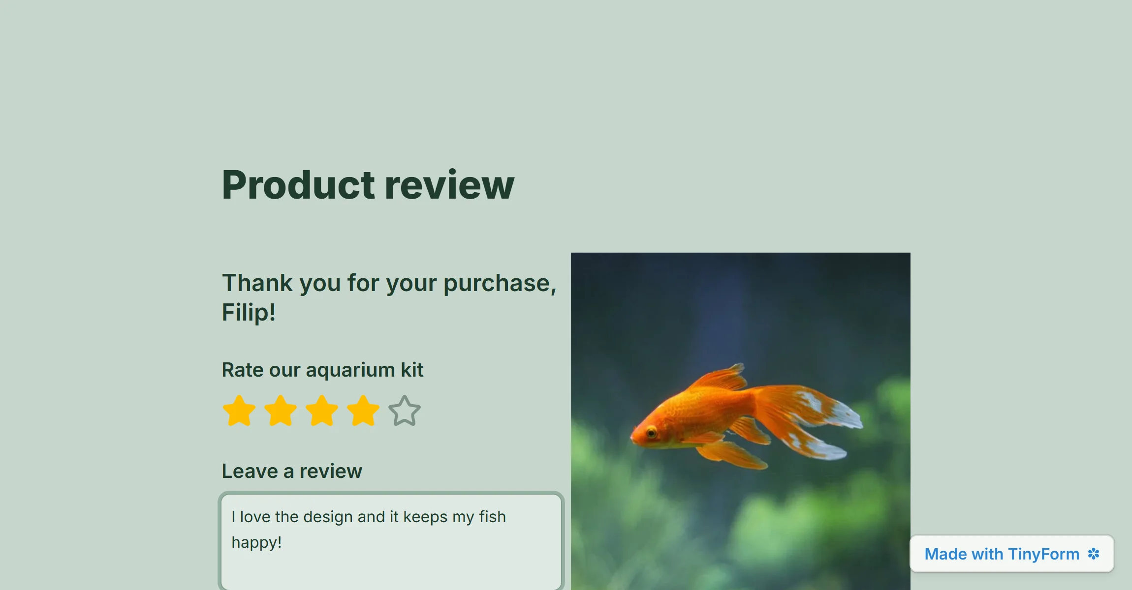
Change colors
Apply a theme
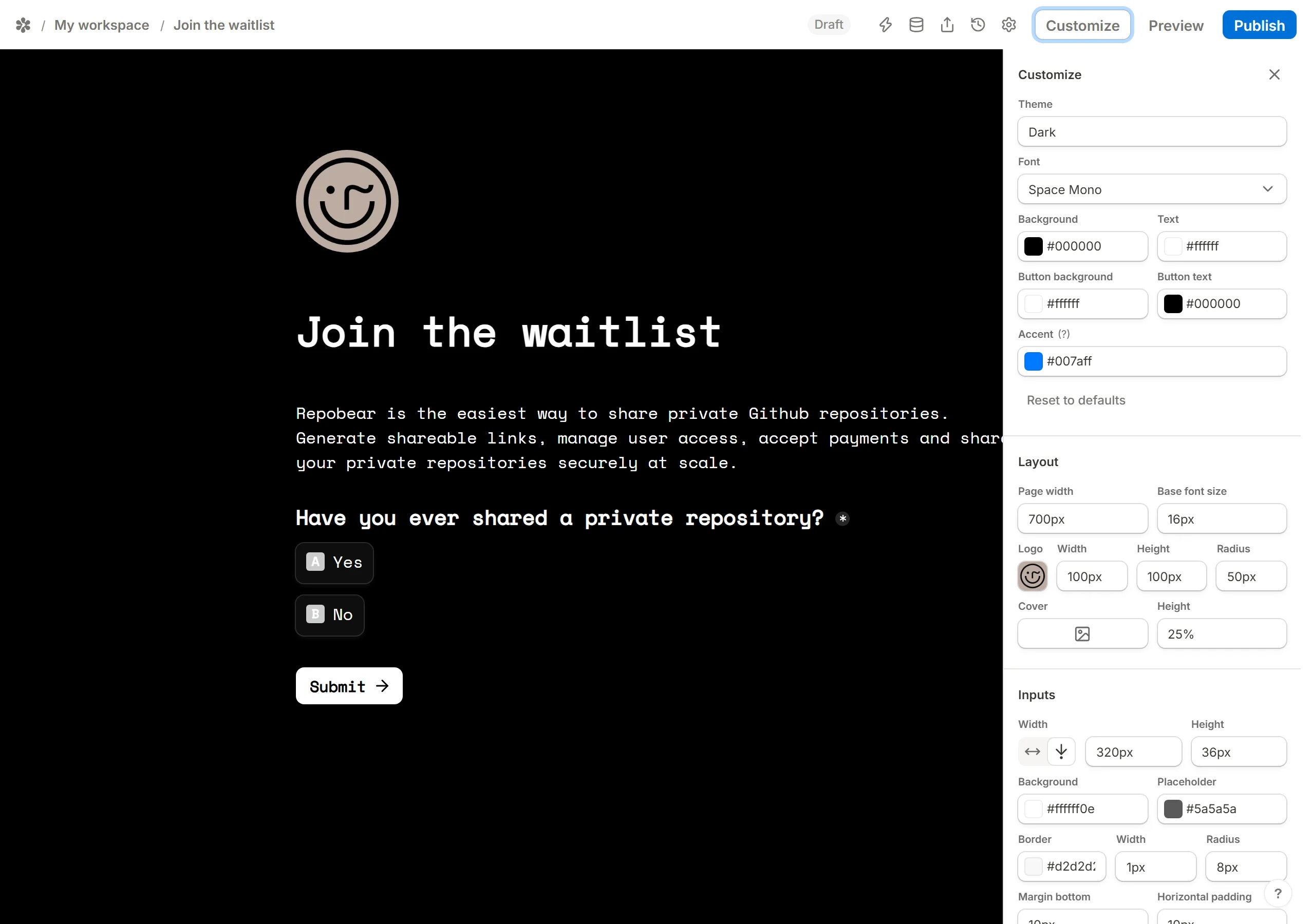
Open the form at /forms/<id>/edit and press Customize above the title. The first row is Theme, with Light and Dark; each sets the whole palette at once.

Create your own custom theme
Under the theme sit the colours it is made of: Background, Text, Button background, Button text and Accent, which is used for links, selected options and focused inputs. Click a swatch to open the picker, choose from the palette or type a hex code. Reset to defaults puts the theme's own colours back.

Reuse your custom theme
A theme is saved with its form, not on its own. To carry one set of colours across several forms, share the finished form as a template and start the others from it. Every copy arrives with the theme.
Change fonts
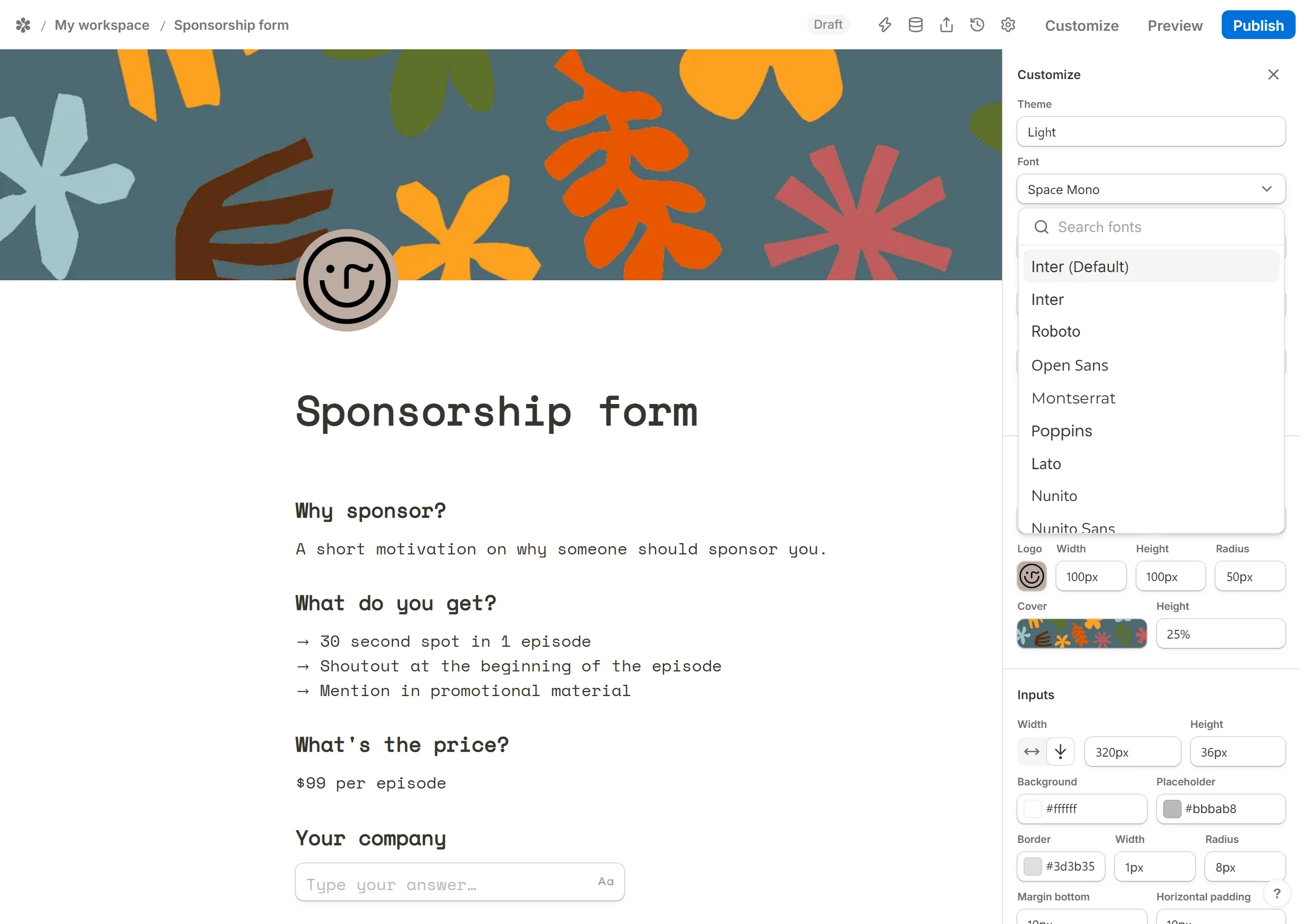
The Font row starts on Inter (Default), a system stack that loads nothing. Open it to search the Google Fonts catalogue and pick any family; the form loads that font on the published page. Where the full catalogue is not available the picker shows a shorter built-in list instead, every entry of which still loads.
Advanced customization
Below the colours the panel has three more sections that set sizes rather than colours.
Layout
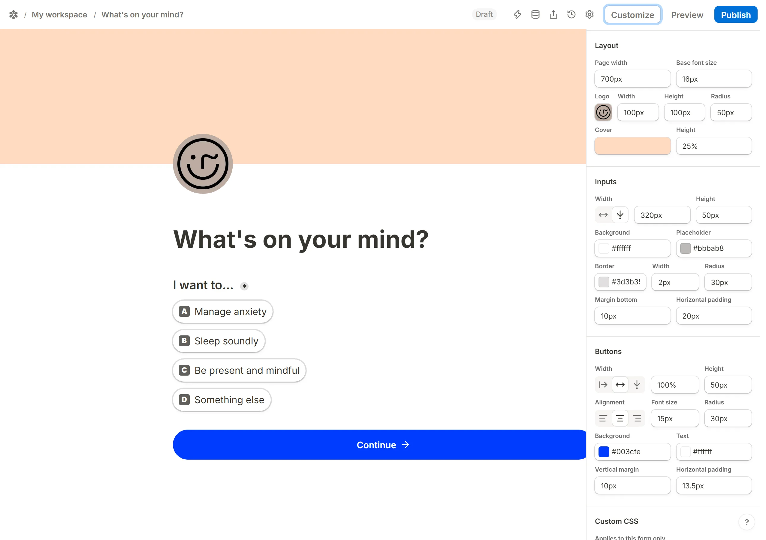
Page width and Base font size apply to the whole form. Under them, the Logo row sets the logo's width, height and corner radius, and the Cover row sets the cover's height.
Inputs
Inputs can be Full width or a Fixed width, and have a height. Their Background, Placeholder and Border colours are set here too, along with the border width and radius, the margin under each input and the padding inside it.
Buttons
Buttons can take Auto width (as wide as their label), Full width or a Fixed width, and have a height. Set the label's font size, the alignment (Left, Center, Right), the corner radius, the background and text colours, the vertical margin around a button and the padding inside it.
Inject custom CSS
For anything beyond the controls, paste rules into the Custom CSS box at the bottom of the panel. It applies to this form only, and every rule is scoped to the form's own wrapper before it is served, so it cannot reach the page around an embedded form. Blocks, the title, the submit button and the progress bar all carry stable class names (.fe-submit-button, .fe-progress-bar, .fe-block-input-email and so on).
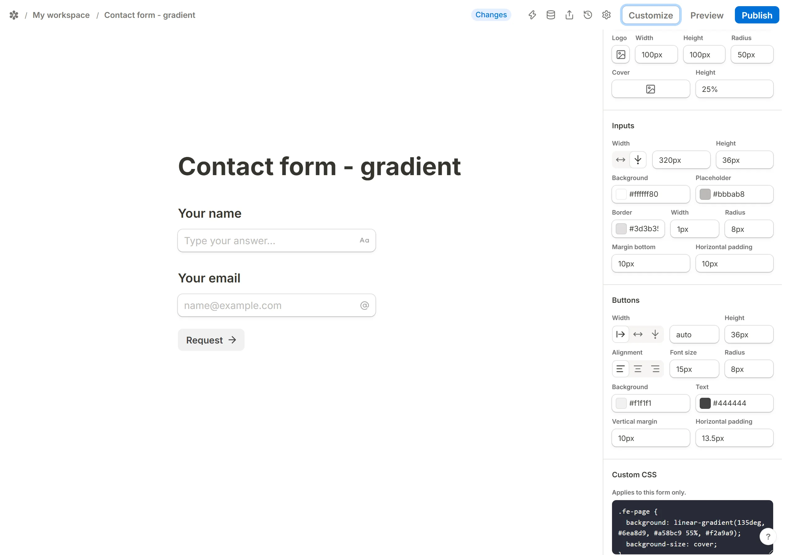
Those class names belong to the rendered form rather than to the editor's canvas, so a rule you paste does not show while you are editing. Press Preview to see it applied, exactly as a respondent will; Back to editor returns.
Format text
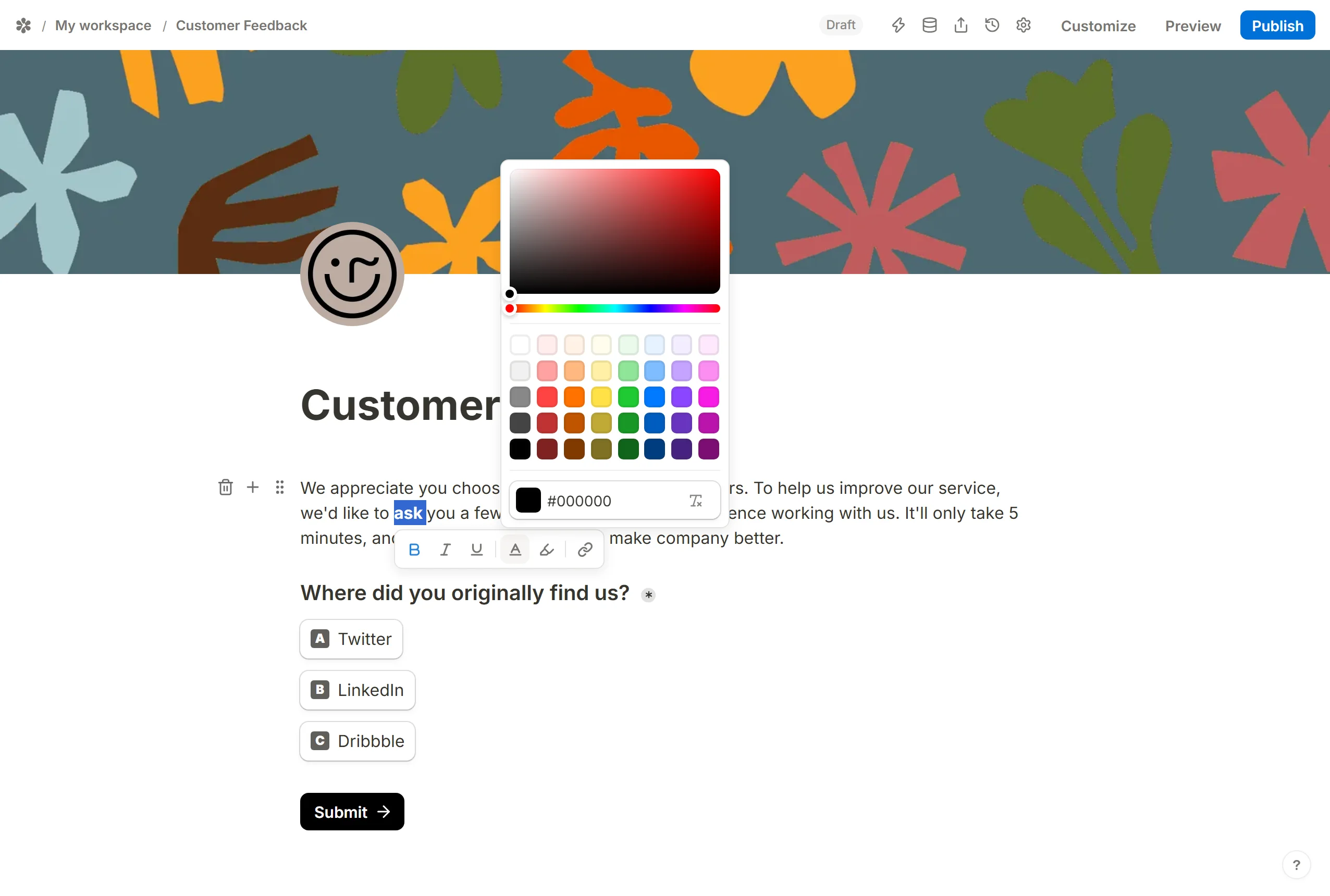
Select text in a Text block and a toolbar appears: Text color, Highlight color, Bold, Italic, Underline and Add link. The three weights also answer to Ctrl/Cmd + B, I and U; the rest of the keys are in Keyboard shortcuts.
To take a colour or highlight off again, select the text, open the colour panel and press Reset.
Add a logo
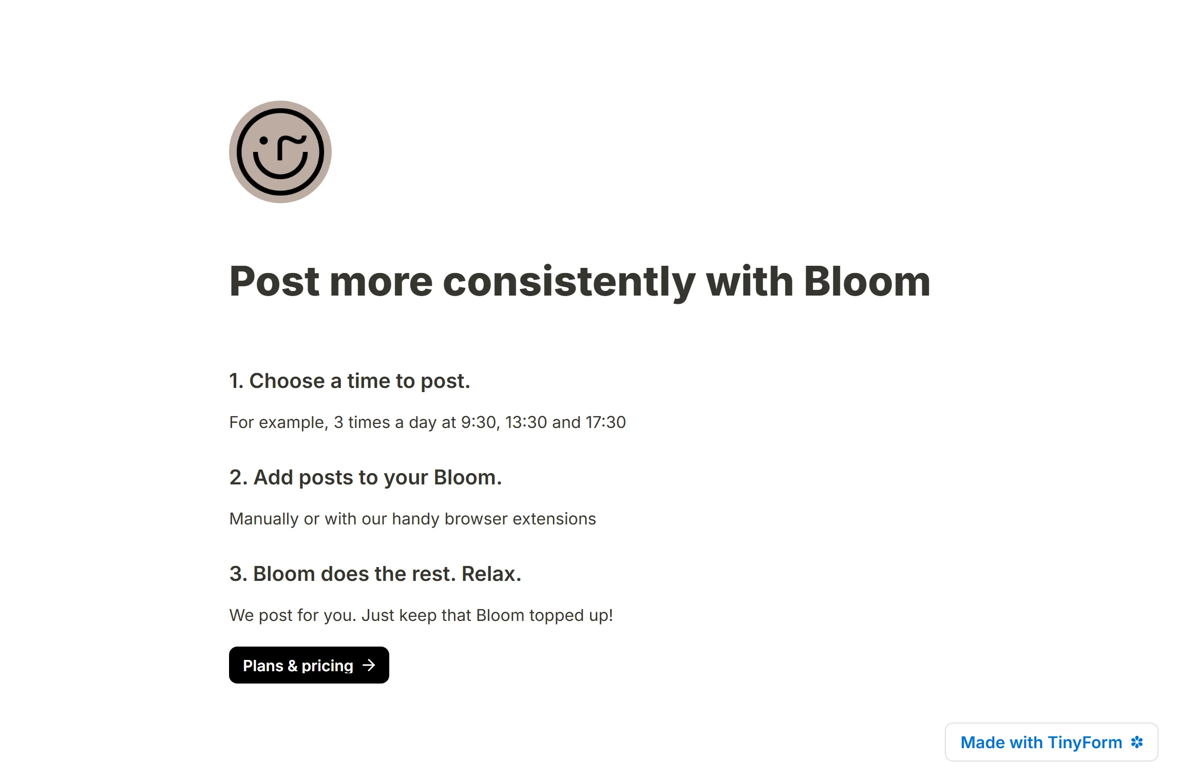
Hover the form title and press Add logo. Upload a file, or paste a link to an image on the web. PNG, JPG, WEBP, GIF and SVG are accepted, up to 2 MB. The logo is drawn as a round mark straddling the bottom edge of the cover, or above the title when there is no cover; its size and radius are in Customize, under Layout.
Add a cover image


Hover the title and press Add cover. The dialog has four tabs: Upload a file, paste a Link, search Pexels for a free photo, or pick one of the four flat Color presets. Once an image is in place, Reposition lets you drag it up or down inside the band and Save position keeps the crop; Change cover swaps it and Remove takes it away. Photos from Pexels are free to use on public and private forms alike.
Use headings

Headings give a long form its sections. Type /heading and choose Heading 1, Heading 2 or Heading 3: large for the main sections, medium for smaller ones, small for a question that wants more weight than a caption.
Insert dividers

Type /divider for a horizontal rule between two parts of a page. It is a block like any other: drag it by its grip to move it.

Edit buttons
Button colours are the Button background and Button text rows at the top of the Customize panel; their size, alignment and radius are in the Buttons section further down.
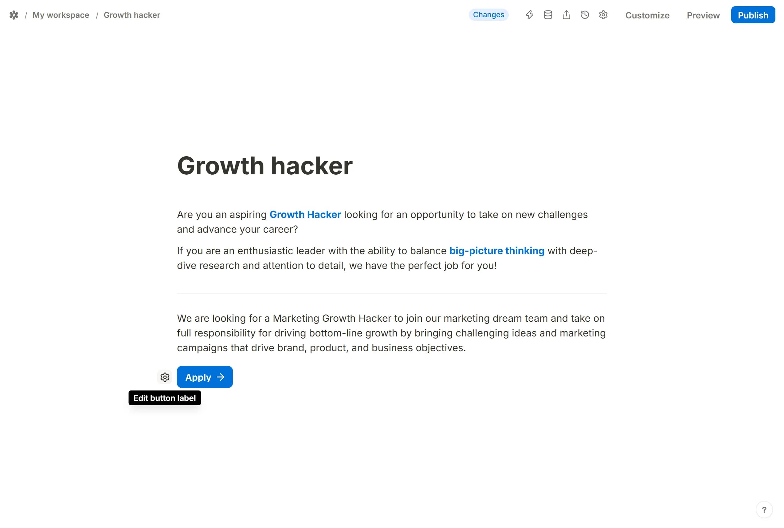
The label is edited on the canvas. Each page ends with the button a respondent will press, Next or Submit; press the gear beside it, Edit button label, and type your own words.
Create columns
Two blocks can share a row. Take one by its ⋮⋮ grip and drop it to the left or right of another; a handle between them resizes the pair. Column layout has the details.
Insert images
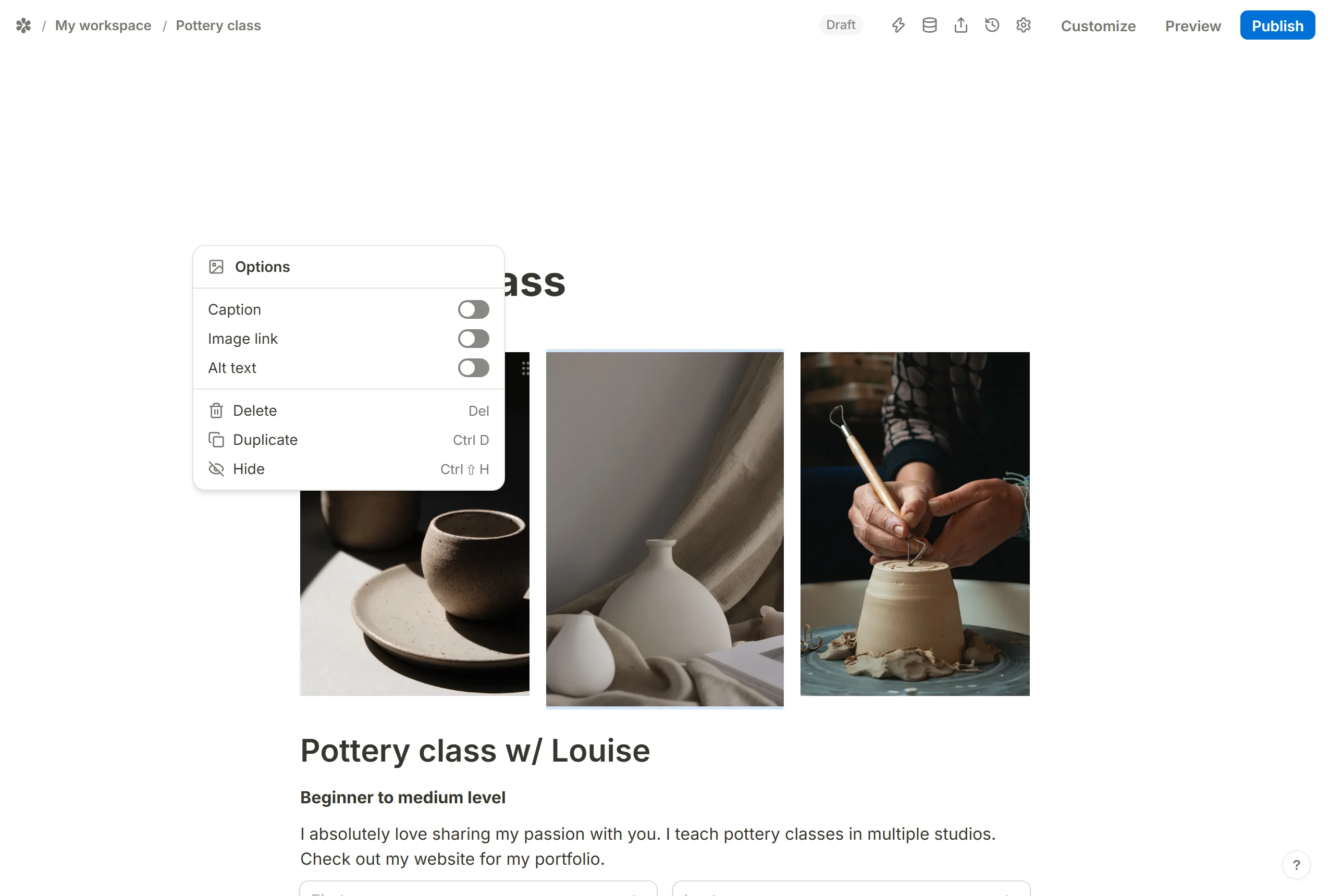
Type /image to add a picture: upload one, paste a link, or search Pexels. Open the block menu with ⋮⋮ for the image's own settings: a Caption under it, Alt text for screen readers, and an Image link that opens when the picture is clicked. The same menu hides, duplicates or deletes the block, and the handles on the picture resize it.
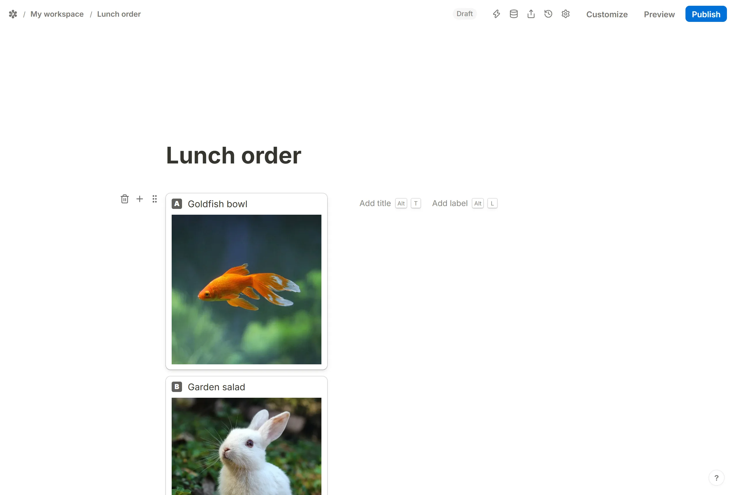
Options in a multiple choice question can carry pictures too. Open the question's block menu, turn on Image, and each option gains an Add image slot that takes an upload, a link or a Pexels photo.
Activate the progress bar
The progress bar shows respondents how far through the form they are, one segment per page, and only makes sense on a multi-page form: with a single page it draws nothing.
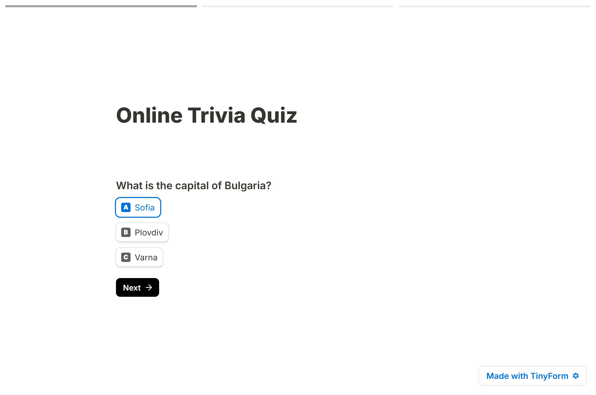
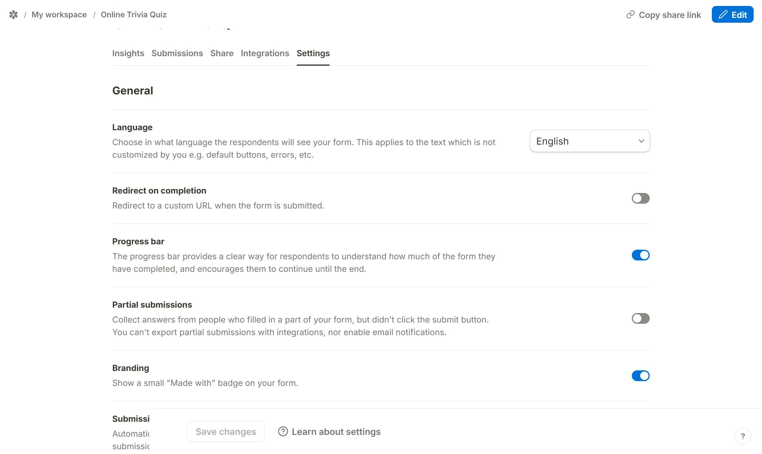
It is a form setting rather than a Customize control. Open the form's Settings tab, find Progress bar under General, turn it on and press Save changes.
Customize link preview (OG image, title, description and more)
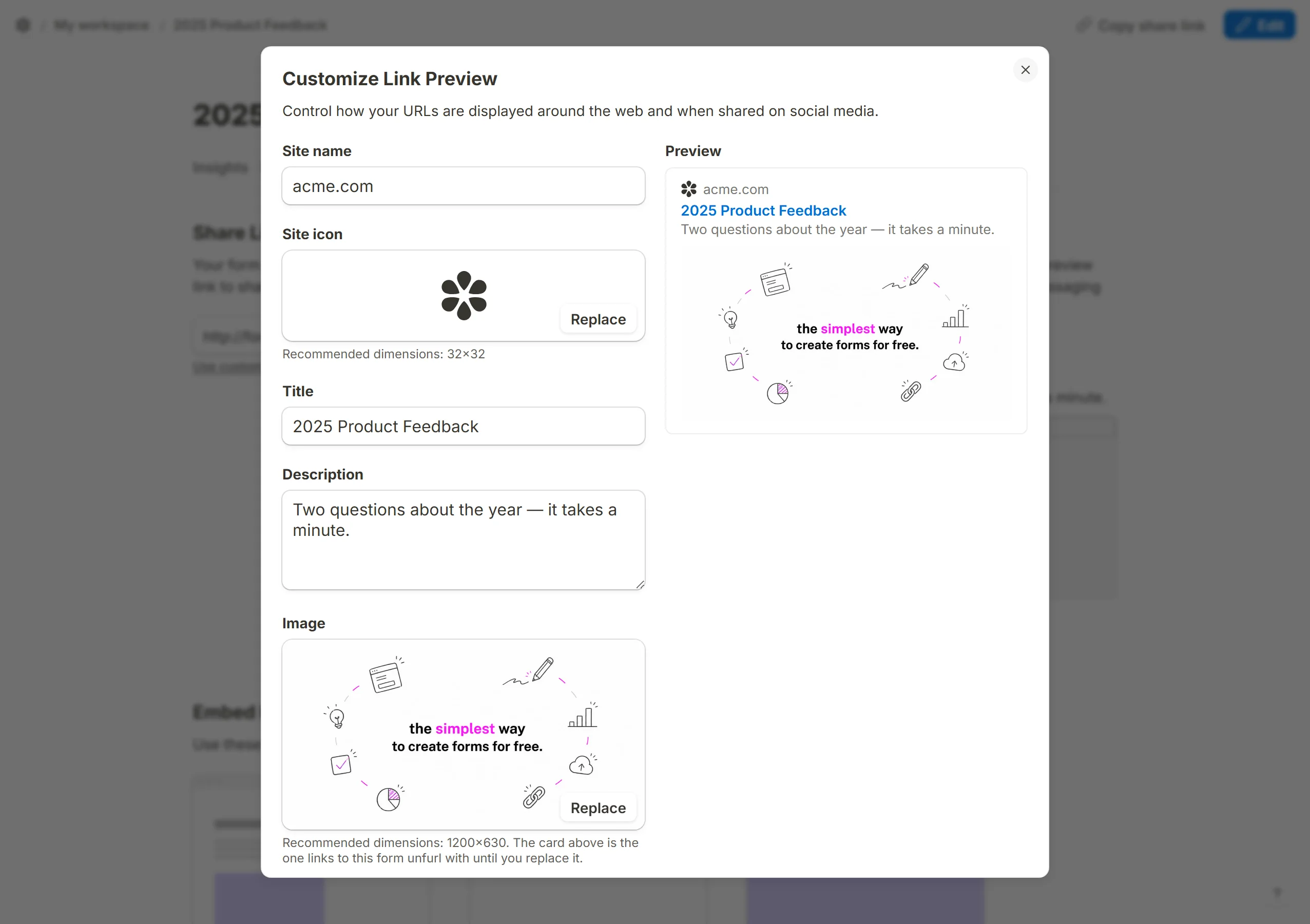
When the form's link is pasted into a chat or a social feed, the card that unfurls is built from the form's Open Graph tags. The Share tab draws that card and its Customize button edits it: the image, the title, the description, the site name and the icon. Fields you leave empty fall back to the form's name and a default picture, and a card you clear entirely falls back the whole way.