Dropdown
Ask a question with a long list of answers in a compact menu the respondent can search, and set its placeholder, badge, default answer and more.

A Dropdown question folds a list of answers into one closed box. The respondent opens it, types a few letters to narrow the list, and picks one. It takes the same space on the page as a text box, which is what makes it the right shape for a list too long to lay out as pills: a country, a job title, an age bracket.
How it works


Open the insert menu with / and choose Dropdown. Type the question above the box, then type the answers one under another: press Enter to start the next option and Backspace on an empty one to remove it. There is no "add option" button, because the options are rows on the canvas like everything else.

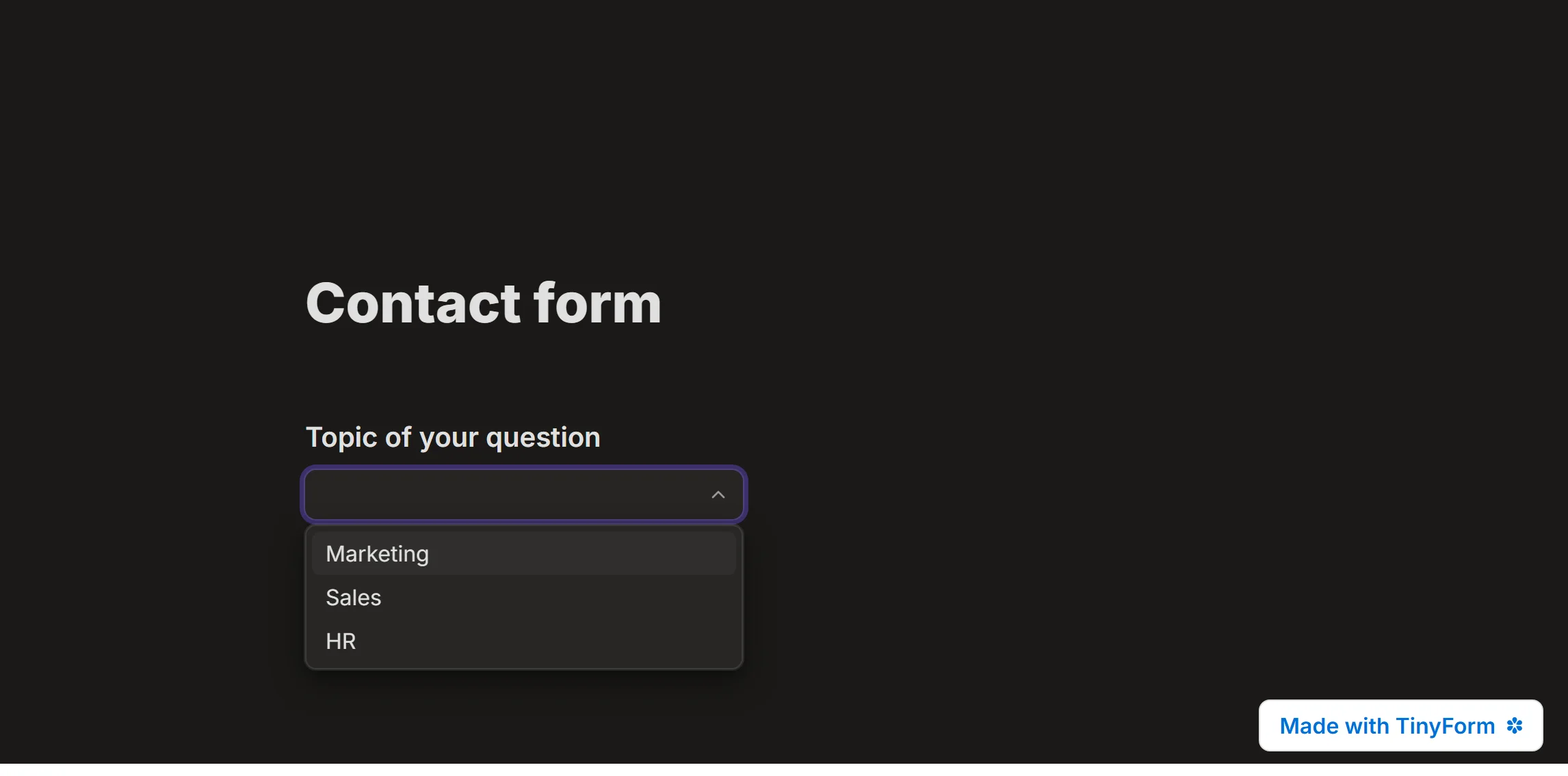
On the published page the box opens a list with a search field. A respondent picks one answer, and typing filters the list as they go, so a list of two hundred countries is three keystrokes away from the one they want.
Dropdown settings
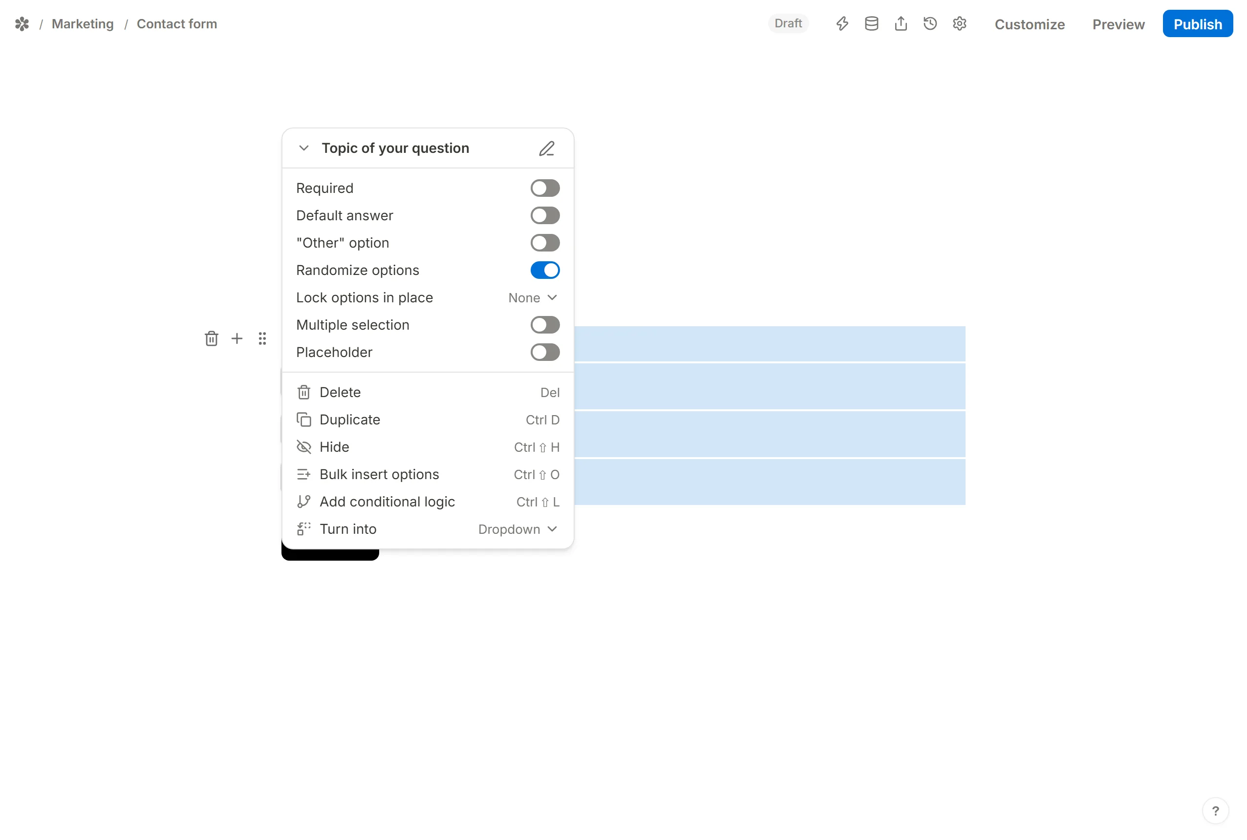
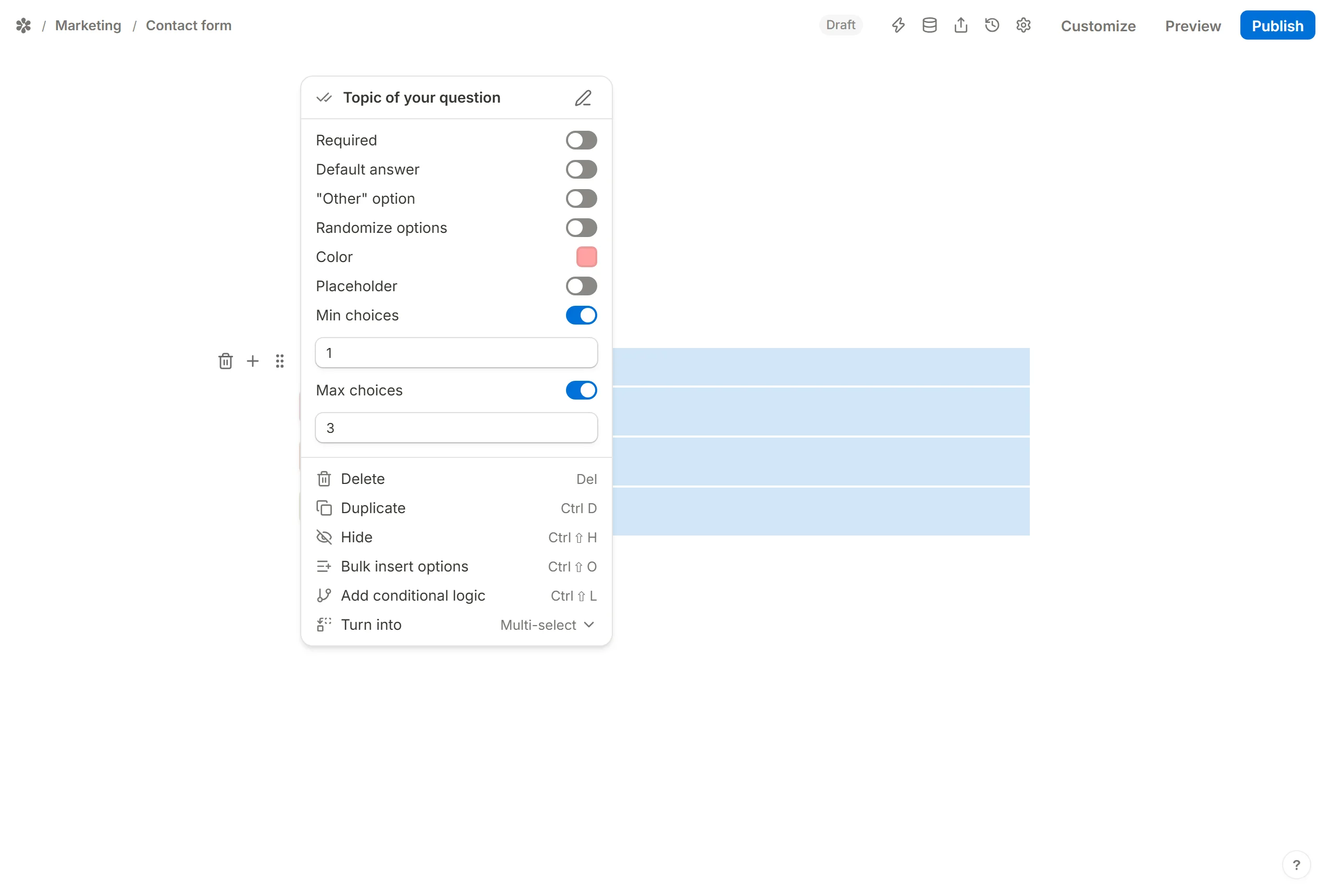
Open the block's settings from the handle at its left edge. The rows below are the ones a Dropdown carries.
Bulk insert options
When the list already exists somewhere else, paste it rather than retyping it. Choose Bulk insert options from the block menu, paste one option per line, and press Insert options. Ctrl+Shift+O opens the same panel from the keyboard. See Bulk insert option lists.
Randomize options
Randomize options shuffles the list for every respondent, so the first answer is not the most-picked answer for no better reason than its position. An option you want to keep at the bottom, an "Other" or a "None of these", gets Lock options in place and sits out the shuffle. See Randomize answer options.
Add placeholder text
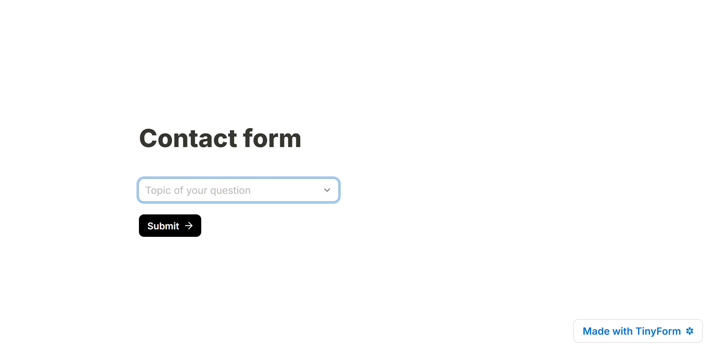
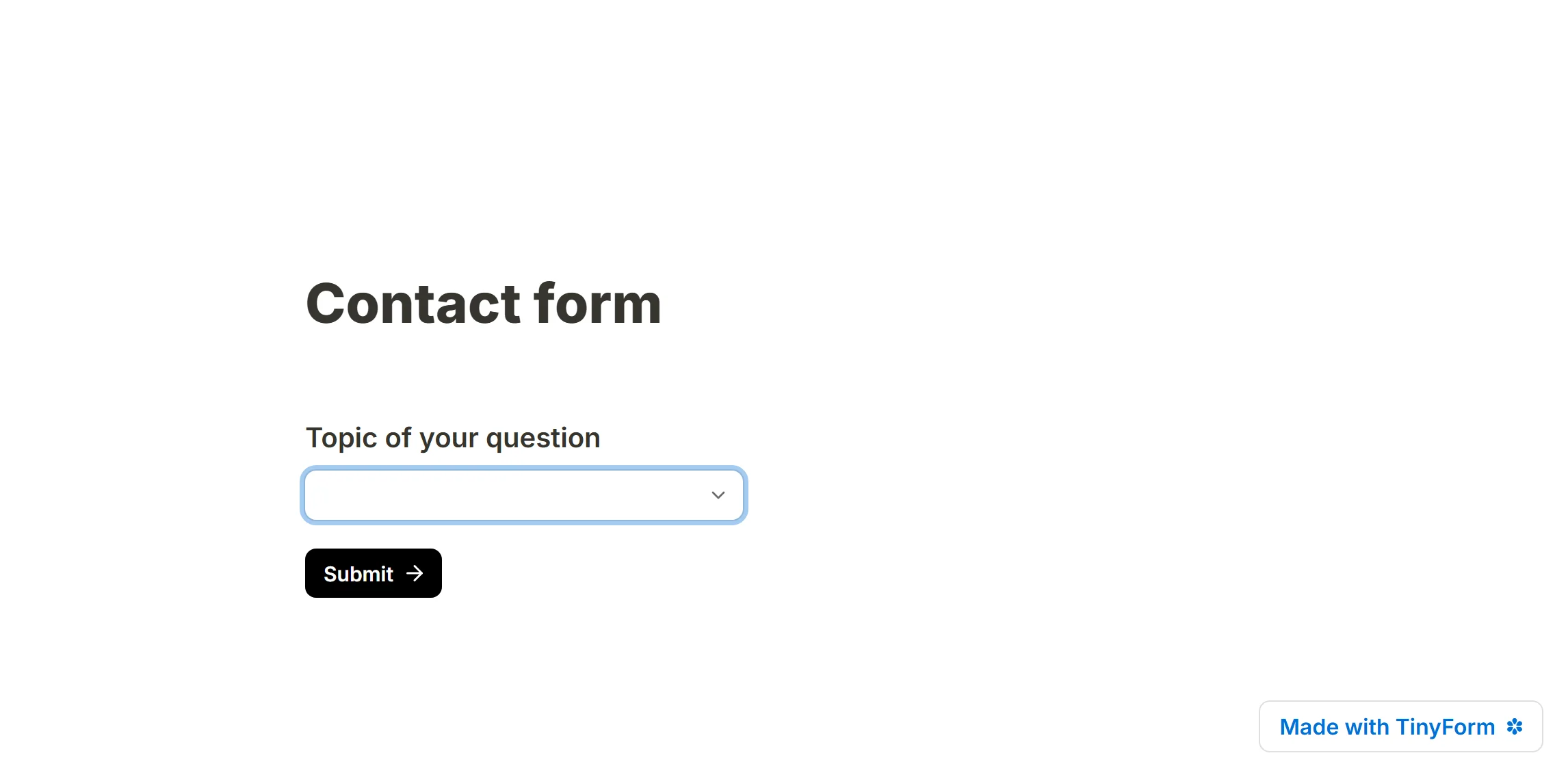
Placeholder is the grey text drawn inside the closed box before anything is chosen. It can carry the question itself when you would rather not draw a title above the box, or a hint such as "Pick your country" under a title that says more.
Add a default answer
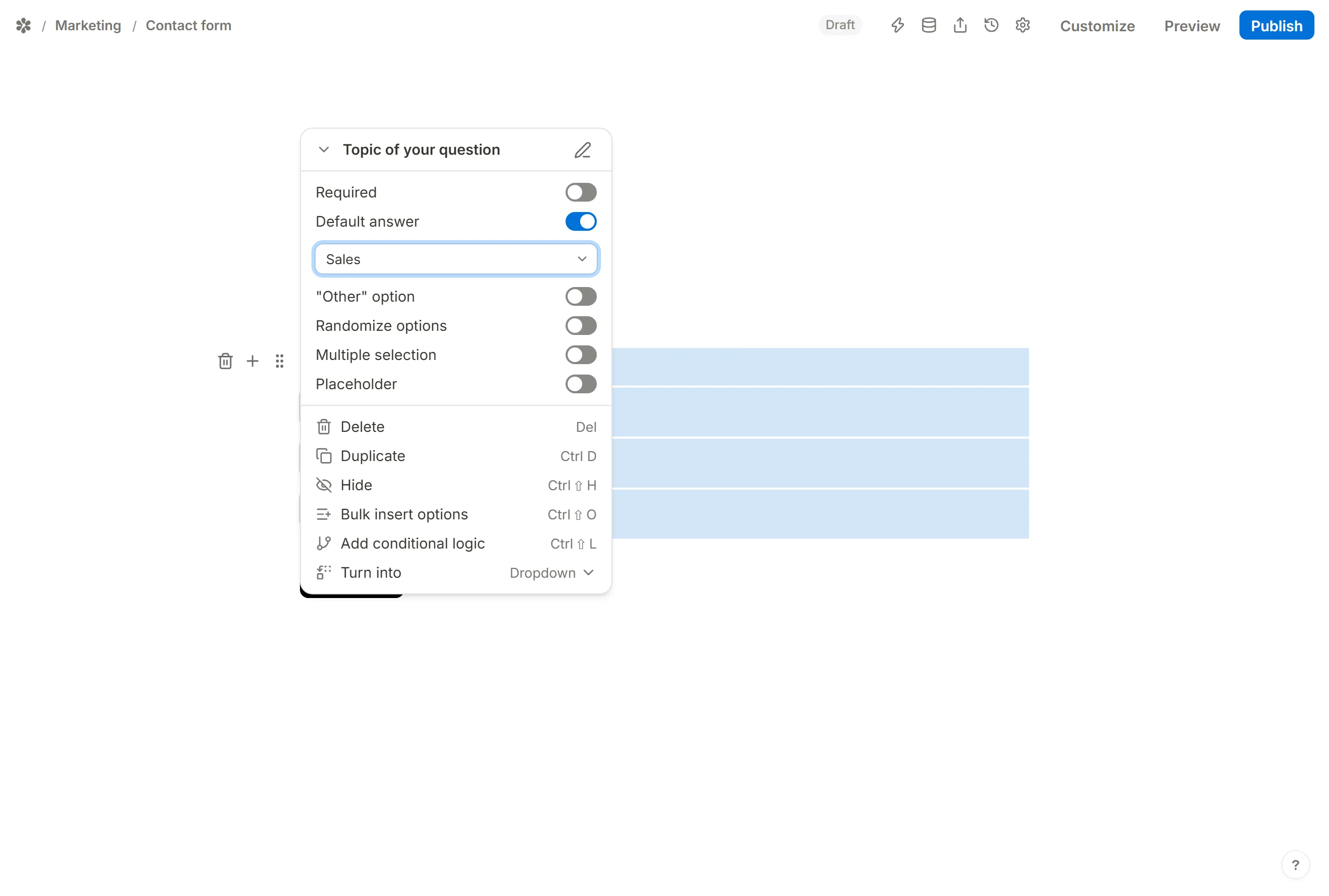
Default answer opens the form with one option already chosen. Pick it from the list, or point it at another field, a hidden field or a calculated field so the choice follows something the visitor brought with them. See Pre-populate form fields.
Badge, colours and an "Other" option
Badge puts a letter or a number in front of each option in the open list, or Off removes it. Color-code options gives each row its own tint. "Other" option adds a last row that opens a text box, for the answer you did not think of. See How to create an other field.
Multiple selection
A Dropdown collects one answer. When you want several from the same list, do not rebuild it: open the block menu, choose Turn into and pick Multi-select. The options and any answers already collected come along. The Multi-select block adds Min choices and Max choices, and the same menu turns it back, or into Multiple choice or Checkboxes. See Multi-select.
Customize the dropdown
The box, its border and its open list follow the form's theme: colours, radius and font set under Customize reach it the way they reach every input. For a change the theme does not offer, custom CSS can target the control. See Customize your form.
Filling the list from somewhere else
The list is part of the form document, so anything that can write the document can update the options. The REST API reads and writes a form, and a script that keeps a Dropdown in step with an external source works by rewriting the block's options through it. There is no built-in link to an outside list.